parrot
by milou • Uploaded: Apr. 07 '10 - Gallerized: Jun. '11
Description:
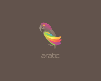
Hi I'm a parrot, and I love nectar, seeds and some plants.
As seen on:
where parrots are going to sleep
Status:
Nothing set
Viewed:
24765
Share:



Lets Discuss
comments are more than welcome mates.
ReplyThanks Tony if you really think so...
ReplyTo be honest, I've made up this agency. And the whole project is for fun. Wanted to make some parrot lately, cuz I was crazy about them. So this is the deal %3B)
Replynice bird man :)
Replycheers bud!
Replymilou is a funny guy, having fun. i like the parrot. Nice description:p put a light color on background so i can see it better...i love nectar too
Replywell executed milou. Are you going to add any type?
Replyheheh myway999! Will do on other background with type, just need to finalize some things.%0D*%0D*thanks mcdseven! I'm going, stay tuned.
Replyhmm... myway999... that sounds familiar... Claude, so you're part of my team, huh? what team? Dude, waiting for your apologies for like months... Do not build your career on false advertising man... %22wtf?%22:http://logoholik.com/myway999.png**@milou sorry for the hijack :) nice shading you got here :)
Reply%5E no probs Bojan. (weird situation by the way)%0D*%0D*Logo is now updated with new wings %26 custom type, thanks for looking. Cheers!
ReplyTony, you're sweet %3B)
Replymilo, for the sake of picking on the colour again, I wish the type is in colour, instead of just highlighting the colour on the wing .**i like this happy parrot by the way :)
ReplyI think you can do better, Milosz (:
Replythe parrot is actually laughing...:)
ReplyHey,%0D*%0D*@Kate hmm, but the type in color motion won't play any good I think... (?) But I'm glad that you like the parrot :)%0D*%0D*@Nikita Thanks, what needs improvement here in your opinion, I'll be very glad to hear it and make it better. I've spent so many hours on this one, so I want to make it the best I can for sure.%0D*%0D*@Nitish yeh, she is, isn't she? :)
Replynice type, nice parrot, nice job!
ReplyAs for me, I like the hole look, however I think the wings look a little unnatural, a bit complicated.
ReplyCheers Paul!%0D*%0D*Nikita, I will think about making it little more simple and will try to do something with it (:
ReplyI really dig this logo, Milou!
ReplyCheers Pierro!
ReplyLooks happy :)!! Love the wings!!
ReplyI'm very glad to hear that Alan Oronoz Madriles! :)
Reply@MILOU! your parrot have cuted wings! Look on your pic on behance, Araras Brasileiras have long and pointed wings. :)**@Oronoz, i dont believe you like cuted araras wings lol.*here in brazil thats a crime!**Btw, its a great Arara :P
ReplyGreat colors as usual, would like to see it in a simplified shape though.
Replynice one milou.
Reply@Breno Thanks for support buddy! Yes they have a wings like that! (: Although to make it more simply looking I've resigned of one umm 'tail wing' or whatever it is called.%0D*%0D*@Alexander I appreciate it!%0D*%0D*@Lecart Cheers!
ReplyHello, i want to buy the eps original design, is it possible???
ReplyHello, i want to buy the eps original design, is it possible??? and can i have the font too???
ReplyLovely logo milou! kudos!
Replymaalysalem - yes, feel free to contact me milooosz@gmail.com, and we will discuss it.%0D*%0D*krinimal - I'm really glad to hear that! Thanks!%0D*
ReplyGood one again!
ReplyThanks again!
Replynice Milou.
ReplyFriendly bird, and beautiful colors. Great one!
ReplyA blast from the past! Nice type work!!
ReplyVery nice :)
ReplyThanks for the nice comments mates :-)
ReplyIt's Milou's day. Look at all those gallery logos :P.
ReplyWOW this is beautiful
ReplyFilipe %26 Jonny - Thanks fellas!
ReplyPlease login/signup to make a comment, registration is easy