Ypsilon
by ArtMachine • Uploaded: Apr. 03 '10 - Gallerized: Aug. '10
Description:
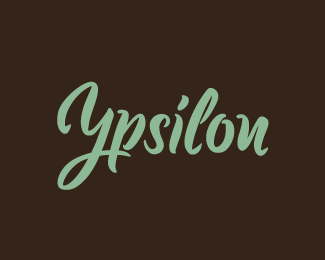
Logo done for practise. This is a vectorized and cleaned up version of some lettering done with a brushpen.
"Ypsilon" is the german word for the letter "y".
Included in "Los Logos Compass".
Status:
Just for fun
Viewed:
9270
Share:


Lets Discuss
A like Anthony :)
ReplyVery Nice Artmachine.
Replynice'n'clear. i like it.
ReplyVery nice indeed.
ReplyLove it Julian! Maybe I haven't been checking that closely, but seems like a while since I've seen something from you. Nice to get a chance to look at some more of your work. Cheers!
ReplyThanks Mike, Andrei %26 Sean. Joe, thank you too. And you're absolutely right, I haven't been able to do a lot of logo work lately. Hopefully that will change.
Replynice work.
ReplyA
ReplyDammit. There should have been a plus after the A, but I guess the form couldn't handle it. Anywho, beautiful solid craftsmanship Julian. Right on.
ReplyWow, thanks a bunch mates!
ReplyJulian, that is great work and typo!
Replyso sweet... type work.
ReplyGreat job, Julian.
Replynicely done type work!
Replygreat type!
ReplyMuch appreciated __**Claude, Milosz, Kevin, Ivan**__ and __**Paul!**__
ReplyDon't know how I missed this one, but it is positively delightful. Very nice clean up work with the brush pen output. I'd be curious to see what this looked like before all that hard work done while refining it.
ReplyThanks a lot JF! Here's the scan of the brushed lettering: !http://www.julianhrankov.com/ypsilon.jpg!:http://www.julianhrankov.com/ypsilon.jpg
Reply%5E respect
ReplyLooks great even before the refining.
Reply%5E%5EGreat!
Replyskills.
ReplyHoly goodness... What artbrush did you use!? Your output is amazing -- your 'rough' of it is phenomenal. You must have a very steady hand.
ReplyThanks a bunch, guys. Appreciated. *JF, Thanks. It's a typical brush pen which you can get in almost any art shop. Well, sometimes my hand is steady and sometimes it's not. :) Actually I find that kind of lettering not that difficult although this was the first time I did it. So go ahead and try it yourself :)
Replyvery nice lettering.
ReplyI could look at this all day Julian, definitely gallery material IMO. Top work bud.
ReplyThanks a lot wujot and Joe!
ReplyThis caught my eye in your showcase and then I scrolled down to find the scan - stunning work
ReplyThis amaze julian! wonderful work!! and the color as well..
ReplyA
ReplyLots of respect for doing it physically and then moving to digital. The results really were worth the process. Fantastic!
Replyohuen4ik!
ReplyBout time it found a place in the gallery.
ReplyNice Work.. really great and inspirational.
ReplyLovely type work, very inspiring.
ReplyGrats on the feature Julian. I'm loving this.
Replylove it%3D)
Replylooks very good, consistent
Replyonly maybe the space between Y and p...
Replyn is very nice, but you can read it as an u
ReplyImpressive work Julian.
ReplyGreat type work!
ReplyThank you all :)
ReplyHappy to say that this was included in %22Los Logos Compass%22.
ReplyI keep coming back to this one...so remarkable, stunning. But, I have to ask: when you say you used a %22typical brush pen%22...you did this on paper, then scanned it in? I'm now in the market for a digital pen, a digital brush pen actually. And I'm hoping someone here -- or yourself -- can let me know if they've used any good digital pens. And if they can recommend a great one!
ReplyHi JF, thanks again, buddy. Yes, I did this with an edding with a brush tip. Can't tell you anything about digital pens though, I like doing things on paper.
ReplyPlease login/signup to make a comment, registration is easy