PVB
by florisvoorveld • Uploaded: Oct. 13 '09
Description:
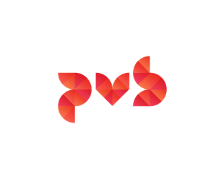
Ok, this one is kinda akward. They want a red/orange logo to represent heat, but with respect for the enviroment.. you know, that trend that won't go over. But they don't like green. So I made their monogram out of 'natural shapes'. Comments are welcome.
Status:
Unused proposal
Viewed:
2255
Share:

Lets Discuss
I enjoy the pattern and colors, but my eyes want to read %22pus%22 and %22pub.%22 I'm not really sure how to solve for that since it's probably just a personal thing for me.
ReplyWell, I agree with you on the pub thing. But I believe it lies in the semantics. And since it's for an Italian company I think (ok, hope) it doesn't matter (since Italians are crap at speaking English, no offence).
ReplySorry I also read Pub:(
Replyi think this is excellent, a very tough brief and you came out with a very nice solution! the fact that the target audience are italian pretty much rules out the pub thing, so i reckon you safe there.
ReplyDefinitely a 'u-like' look to the middle letter. Needs to have more of a sharp base, rather than a curved one, my friend. Overall, nice graphics work.
ReplyLove the effect! But, read it 'PUS'..
Replychanged the 'v', hope it's more clear now.
ReplyYep, looks even better now!
ReplyI read PVS, sorry... Do you try to flip the top part of the %22b%22 ?
Replyyes, but it disturbs the image
ReplyThe pattern looks really nice, but i'm having some troubles reading it too.
ReplyPlease login/signup to make a comment, registration is easy