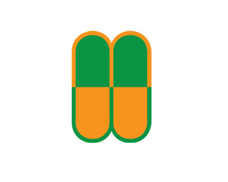
MW Capsule
by fineline • Uploaded: Aug. 19 '11

Float
(Floaters:
0 )
Description:
Concept for a monogram logo using the negative space between the m and w to depict two pharmaceutical capsules.
Status:
Just for fun
Viewed:
1402
Share:
Lets Discuss
need more work on this logo because idea is good but execution is not very well. keep it going
ReplyI think what qyper was trying to say is that there is no way to see the M and W, so it just looks like two pills. I think you actually need to create an MW and then try to work in the pills in the negative space.
ReplyI take the point but there is an m and w using itc Bauhaus. The use of green on top half and yellow on the bottom was an attempt to make the two letters readable separately. **I was thinking of extending the first stem of the %22m%22 upwards to make it look more like an m. (Not sure the technical term for that part of an m.)
Replyit doesn't work because capsules already naturally have a color change right in the middle, so all we see is two capsules next to each other. None of us would have known that the point of it was an 'm' and a 'w' if it weren't in the description. Good designers try to defend there work a lot less than they try to improve it.
ReplyI'm not ignoring the criticism or getting defensive. I have suggested way I might change it to make it better and am still working on it. **I think that I can work the capsule's colour change to my advantage and am going to keep trying.
ReplyI have uploaded a new version of this to address the legibility problem and I would appreciate your thoughts http://logopond.com/gallery/detail/144806
ReplyPlease login/signup to make a comment, registration is easy