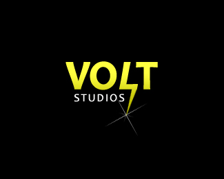
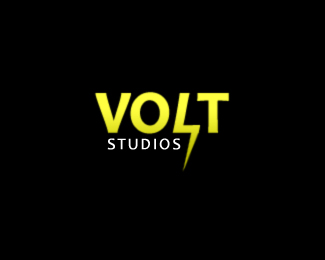
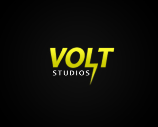
Volt Studios
by evoltix • Uploaded: Apr. 20 '08

Float
(Floaters:
5 )
Description:
This is the 10th revision of this logo. Feedback wanted.
Status:
Nothing set
Viewed:
1344
Share:


Lets Discuss
You must be tired of looking at this now. Revision 6 is the best one IMO, followed by this one.
ReplyJust a thought... but if you played with your negative space in between the L %26 P you can create a bolt without having it be so literal. :)
Replyhe meant T.. L %26 T %3B)
Reply@ Bart : Yup, I had the same idea.
ReplyYeah L %26 T, thanks Nido! :)
Reply@ Bart: I've tried relentlessly to get the negative space between the L and T to create a bolt but I just can't get it to work unless I'm missing something. I'm still trying to brainstorm more concepts since this logo isn't really flying with the people.
Replyno problem Bart man.. now my work here is done..i am needed elsewhere!
Replyoh wait.. @evoltix, try this.. you may have to customize a font, but bring down the bar that goes across the top of the T so its closer to the extension at the bottom of the L.. this will narrow down the big square you have at the moment %26 make it to appear me like a bolt of lightning.. (you'll have to adjust the V %26 O to suit) then create an arrowhead type of extension on the top of the left hand side of the T %26 a similar one pointing down the way on the bottom of the right hand side of the L.. completing the 'lightning bolt' in the 'white space'.. hope that helps.. but more importantly.. hope it makes sense :)
ReplyThe key to pulling the negative space mark off would be the choice of typeface. It needs to be bold and the cap height needs to be minimal to create the shape, with some modification to the typeface as well. :)
ReplyAnother idea would be to put a lightning bolt as the center of the %22O%22.
ReplyDude - it's fine as-is. You've brought it a long way since your first iteration. I would put it to bed and call it a job well done. Nice work.
ReplyI think that a massive opportunity was missed on this one. The negative space was never fully exploited to convey a bolt IMO. The 'L' looks like an icicle to me.
Reply@fogra: I'm currently trying to exploit the negative space between the L and T. Never knew the L looked like an icicle in this one.**Thanks guys for all your feedback. I'll post a new concept soon. Keep your eyes open.
ReplyPlease login/signup to make a comment, registration is easy