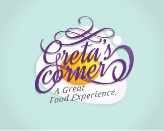
Greta's Corner
by doraemon74 • Uploaded: Jan. 30 '14

Float
(Floaters:
0 )
Description:
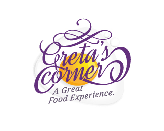
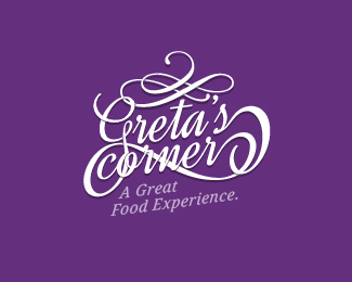
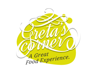
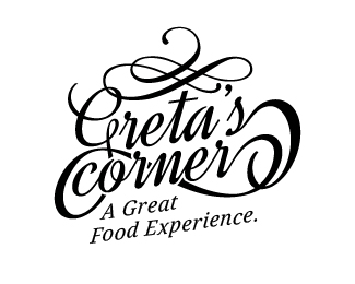
The goal is to create a logo that can express the same elegance, glamor and informality trying to respect the architectural lines that characterize the locals.
For this reason it was decided to use an italic font, vintage style, enriched with additional gathering and compacting daughters lements that make up the new brand.
As a graphic add-on has been inspired by the irregular shapes and rounded egg as an ironic reference to the simple and genuine cuisine.
Status:
Client work
Viewed:
1414
Tags:
fried egg
•
corner
•
greta
•
experience
Share:


Lets Discuss
Please login/signup to make a comment, registration is easy