you could refine the negative space more to make it more like a helmet, maybe drop the end on the fern down a bit. Otherwise, its a lovely mark you could turn it into a seal.
Google meets USC :) I totally agree with making the transition smoother. The bottom of the G looks weak and thin, like the leaves are going to bend down a crush it.


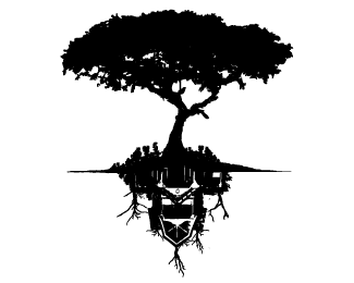
Lets Discuss
It'd be cool if you could work out a more gradual transition from the %22G%22 to the stem, but other then that i think it's a solid mark
ReplyI'll try that, thanks!
Replyyou could refine the negative space more to make it more like a helmet, maybe drop the end on the fern down a bit. Otherwise, its a lovely mark you could turn it into a seal.
ReplyThank you for the comment hellouriah!
ReplyGreat job merging the two elements. This works nicely.
ReplyThank you Ocularlnk!
ReplyGoogle meets USC :) I totally agree with making the transition smoother. The bottom of the G looks weak and thin, like the leaves are going to bend down a crush it.
ReplyPlease login/signup to make a comment, registration is easy