deep
by dimARTirosov • Uploaded: Jun. 05 '09

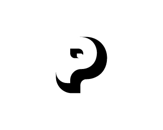
Float
(Floaters:
11 )
Description:
My first ambigram logo, just for fun.
Status:
Unused proposal
Viewed:
1953
Share:


Lets Discuss
Nicely done.
ReplyThanks Joe :)
ReplyIt's nice. Alas, someone beat you to it:*http://logopond.com/gallery/detail/42443
ReplyClean! liked it, mate
ReplyThanks teeps!%0D*And darrel, what can i say, CRAP! %3B) but i guess its ok since i've made it just for fun.
ReplyThanks nima, means a lot!
ReplyI actually like this more than the one Darrel pointed out - well done!
ReplyThanks again sam!
ReplyClever and great execution mate :-)
ReplyThanks Mads.
ReplySince it reads deap instead of deep, have you thought adding a whitespace between lower and upper part of e, so when rotated it can also read as e as in deep?
ReplyHmmm... i've read you comment about five times now and still didnt undestood exactly what you mean.. though i must agree its not a full %22by the rules%22 ambigram :)%0D*%0D*So can you explain further?
Reply*your comment
Replysee http://logopond.com/gallery/detail/68952%23logoholik_127444 :)
ReplyPlease login/signup to make a comment, registration is easy