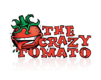
Looking good!**I might suggest smoothing out a few of the curves on the tomato, etc. and perhaps bumping the visibility of the leafy bit (looks a bit like an afterthought...) Otherwise, again I like where its going!
agree with mike. getting closer. i am liking it though. Also maybe the spacing between the m%22 and the %22a%22 in tomato seems a little too much. IMO.


Lets Discuss
Looking good!**I might suggest smoothing out a few of the curves on the tomato, etc. and perhaps bumping the visibility of the leafy bit (looks a bit like an afterthought...) Otherwise, again I like where its going!
Replyagree with mike. getting closer. i am liking it though. Also maybe the spacing between the m%22 and the %22a%22 in tomato seems a little too much. IMO.
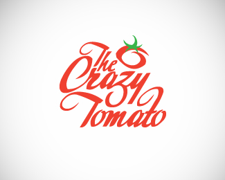
ReplyThanks guys. All good points :-)
ReplyI like this one better than the other version with the small tomato for sure
Replygreat type execution
ReplyGreat logo design Michael :) I like it**Carried in Cruzine: http://www.cruzine.com/2010/09/17/restaurant-logos/
ReplyAwesome Oliver. Thanks for featuring my logo!
ReplyPlease login/signup to make a comment, registration is easy