by dadapaky • Uploaded: Jan. 05 '09
Add to Pad (In 0 Pad s )
Description: Service Organizations Status: Nothing set Viewed: 889 Share:
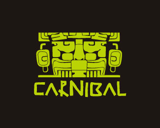
I like the yin yang feel of this. The shadow sucks, however, and takes away greatly from the logo.
The logo reminds me of two Koi crossing over one another. I agree that the shadow distracts from the entire logo. The image could also easily replace the N in the logo if worked over correctly.
Please login/signup to make a comment, registration is easy
Follow


Lets Discuss
I like the yin yang feel of this. The shadow sucks, however, and takes away greatly from the logo.
ReplyThe logo reminds me of two Koi crossing over one another. I agree that the shadow distracts from the entire logo. The image could also easily replace the N in the logo if worked over correctly.
ReplyPlease login/signup to make a comment, registration is easy