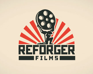
Nice idea. Try adjusting your kerning a bit...and perhaps try making the right side of the hammer head a bit thicker/straighter/sharper i.e. the leg of the 'R'?
Thanks Michael, I'm going to try that. After reading your comment, it made me think of doing something completely different than what you said at first though, funny how the mind works!*On a side note, I am a bit of a fan of your work especially %22DEBUT LONDON%22 very inspiring!


Lets Discuss
This logo is in the works, so any suggestions would rock!
ReplyNice idea. Try adjusting your kerning a bit...and perhaps try making the right side of the hammer head a bit thicker/straighter/sharper i.e. the leg of the 'R'?
ReplyThanks Michael, I'm going to try that. After reading your comment, it made me think of doing something completely different than what you said at first though, funny how the mind works!*On a side note, I am a bit of a fan of your work especially %22DEBUT LONDON%22 very inspiring!
Reply@clarmont - Cheers! Happy to get the wheels spinning %3B)%3Cbr%3EAnd thanks a lot for the comment on 'DEBUT'!
ReplyPlease login/signup to make a comment, registration is easy