GIL University
by ch3 • Uploaded: Jan. 23 '13


Float
(Floaters:
1 )
Description:
Hello everyone! This is my first, and hopefully not last, submission to this excellent site.
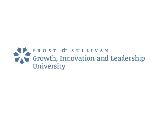
GIL University is a global institution specializing in corporate training. The client wanted something simple (they are fed up with corporate imagery), that could work as a single mark but also have an element that can be taken out and used on its own (e.g. for bullet points)
It also has to come together with the mother company logo (which can be in two variations of blue, or black)
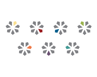
The idea is loosely based on the shape of the kite, 7 elements for 7 portfolio areas (each section has it's own colour, which is also used in other materials)
The font used is Noticia Regular.
Status:
Work in progress
Viewed:
2714
Tags:
leadership
•
innovation
•
growth
•
training
Share:

Lets Discuss
Please login/signup to make a comment, registration is easy