The Digital Mob
by bslate • Uploaded: Oct. 30 '08

Float
(Floaters:
5 )
Description:
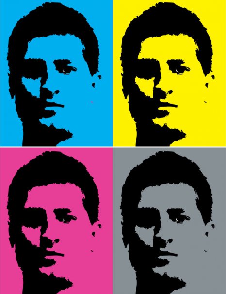
My design company logo.
As seen on:
Status:
Nothing set
Viewed:
4572
Share:


Lets Discuss
Dude, the mark is GREAT! work on the type. Don't let the type let such a brilliant logo down.
ReplyGosh that is very COOL BRO.
ReplyGreat mark !
ReplyI guess no one else sees the face? looks like a pitbull/mobster.
ReplyI saw a bulldog/boxer, but yeah the type does let it down.
ReplyLOL, thats what I meant Roy ,guess ya know yer dogs %3B-)
Replydamn this is a good!!! typo is shot, But this is a strong mark
ReplyThanks for the comments - also the origianl type is in godfather and digital for digital but i did not think it looked good sized down for logopond - I was wrong i should have left it.
ReplyNice symbol. Works better in one color. (the font could be improved, I don't think it works well with the symboll)
ReplyPlease login/signup to make a comment, registration is easy