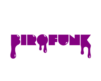
Snooze
by birofunk • Uploaded: May. 04 '10

Float
(Floaters:
5 )
Description:
I haven't uploaded anything here for awhile.
My time has been taken up by a side project called Snooze. It's a collective of animators and designers who make short films.
We are in the process of rebranding and this is my first proposal.
As we focus mainly on animation I wanted to convey motion in the logo.
I would love to hear your thoughts on this one!
As seen on:
Snooze
Status:
Client work
Viewed:
2710
Share:


Lets Discuss
I think it looks nice.
ReplyYes this is looking intresting. I like the loose informal type but think it still needs a little development. Those 2 'O's could join together and give suggestion of eyes 'snoozing'. Or what about that 'Z'zzzzzzzz. Just some off the wall reactions. I used same colours on a logo, check it out http://logopond.com/gallery/detail/101535
Replythanks Stelian!**@Johnny thanks for the comment but I'm going to avoid using a cliches like z's or eyes sleeping.
ReplyOk B fair point about cliches, but it needs something just to make it your own. Over sized 'S' wud give it more ownership and identity. I wud also be tempted to pull characters together so they are more united. Hope this is helpful.
Replythanks for the input Johnny I'll look into that!
Replyi like your logo :)
Replythanks...glad you like it!
Reply%3Ca href %22http://www.logonest.com/2010/05/snooze/%22%3ESelected for Logo Nest%3C/a%3E
ReplyPlease login/signup to make a comment, registration is easy