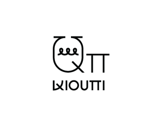
Kivotos tou Kosmou
by b-positive • Uploaded: Apr. 03 '15

Float
(Floaters:
1 )
Description:
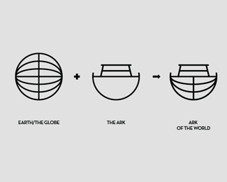
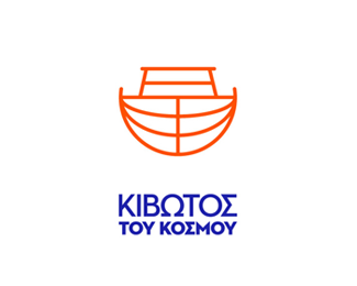
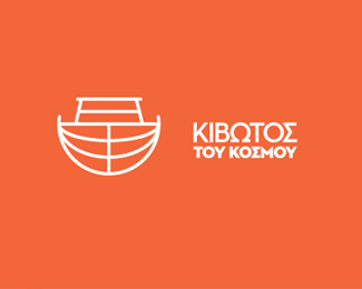
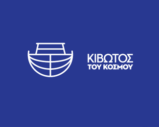
Visual Identity for Kivotos tou Kosmou (Ark of the World). “Ark of the World” is a non profit organization with a mission to take care of children that have been experiencing abandonment, racism and social exclusion on daily basis in one of the most downgraded areas of Athens, Akademia Platonos (Plato’s Academy). The organization relies only to donations and volunteer work. At February 2014 we volunteered to redesign their identity. We came up with a nice and bold symbol that combines the earth and the ark. The way is designed gives you the feeling that the ark is coming towards you or is going from left to right. We felt that the old logo and identity could not represent the amazing work of the organization. We also wanted to give the Ark a more international look, as most of the donations come from individuals abroad. The colors we chose are blue that stands for the color of the sea, of the earth and creates feelings like safety, trust and stability. The orange color is the color of something “new” and fresh, and creates feelings like hope and happiness.
As seen on:
Comeback Studio
Status:
Client work
Viewed:
1525
Tags:
•
comeback
•
athens
•
greece
Share:


Lets Discuss
Please login/signup to make a comment, registration is easy