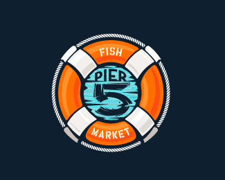
Pier 5 Fish Market - full color, minimal version
by atomicvibe • Uploaded: Aug. 12 '11

Float
(Floaters:
8 )
Description:
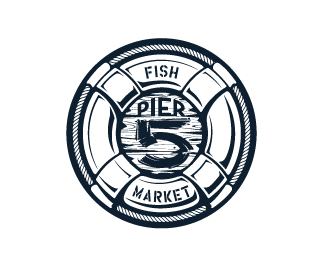
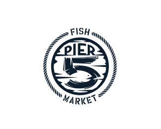
Logo for a fish market that captures the spirit of the nautical and maritime aesthetic. There is a fish shape in the negative space within the bowl of the number 5. Type is custom for "Pier" and also the number 5, which is hand-rendered to look like it was painted on a wooden sign with a very wide, worn-out, thick-bristled brush.
Status:
Just for fun
Viewed:
5548
Tags:
brush strokes
•
brush stroke
•
brush
•
stencil
Share:


Lets Discuss
like ... I'm your fan ... you know ... so interesting to see all your logo experiments .. very skillful work ...*and very unique ... so thanks for sharing !
ReplyThanks for the really kind words, Bernd! During times when real client work is down, these self-initiated experiments really help keep my creative mind and skills fresh.
Replya few things, and it's only a nit-picky crazy person (but it also means that I really love and respect your work).**I think this version works better than the other one because I see the fish. There's a lot happening in the other one that takes away from the wonderful subtlety of the fish. I would be alright with that if it was something that added to the hidden fish concept, but sadly it distracts me. You have a b/w version of the tube one on flickr that i think works better than the others shown here because it calls attention to the center more. *http://www.flickr.com/photos/atomicvibelogo/6034724363/in/set-72157627291127623/**With this version, I would play with the rope a little bit, giving it little 'half-chunks' to the ends so that it comes to flat ends instead of angled (does weird things to the type), and i think they could be given a little more space from the type.**The word 'PIER' could do with a couple tiny notches taken out of it. It's just a touch too perfect haha**The teal (while it works on the other one with the heavy orange, I don't think works as well on this version. It actually may be the black sitting on top of the blue. Would it be legible if you changed all of the black to white? Maybe you'd have to darken the blue a little.**I also really am drawn to the bottom left version here:*http://www.flickr.com/photos/atomicvibelogo/6035277586/in/set-72157627291127623/**I enjoy the simplicity.**Anyway, I've just realized I've written a novel. I should probably get back to work! haha**Have a good one, friend.
ReplyWow Nathan, thank you so much for taking the time to provide such a detailed and thoughtful critique. I don't take it as being nitpicky%3B I think these kinds of comments are extremely helpful, and I wish more people provided this level of feedback around here.**OK, moving on, I think you're spot on with the issue of how the rope interacts with the type. You can probably tell that my rationale for doing it this way was to remove full pieces of rope so that I didn't end up with something that looked like I placed a white box behind my type to cover the rope behind it. However, in retrospect, I think your solution would work, and it would help ease that tension.**Heh, while I do agree that the word %22Pier%22 could use a little bit of texture or imperfection, I really didn't want to go ... wait for it... wait for it... OVERBOARD with it. I tried distressing it early on, but opted for a more clean look because of all the other stuff going on around it. But, you raise an interesting point, so perhaps I'll revisit this idea.**Regarding your thoughts on teal and black VS. white type, I actually wrestled with this quite a bit. My original idea was to at least have the 5 done in white, to simulate white paint on a blue-stained board. And while I REALLY wanted this to work, I felt that the end result was a fish that was *TOO* apparent. With a white 5, that blue negative space really jumps out at you, and I think you read the fish first, and THEN realize it's also a 5. I definitely didn't want that. I want the viewer to *almost* miss that there's also a fish in the design, and then, at the last second, have a moment of revelation when discovering it.**But I'll keep playing with this. The beauty of these experiments is that you can play endlessly.
ReplyI think what actually drew me to that bottom left one (mentioned in the last comment) was the white 5 on the blue. I lived on the coast for 12 or so years, and the white on blue just feels right %3B)**Cool piece, man! And I agree, while it's always nice to get a %22this is awesome%22 comment, It's always good to get real feedback.
ReplyI hear you. Err... I READ you. In addition to just being naturally drawn to the ocean/beach/lakes/really any bodies of water, I grew up in MD, and spent many a summer in Ocean City. Also, I lived in Annapolis for quite a bit of time, and now I live in Baltimore, and my fianc%E9e and I have taken to vacationing in Cape Cod the past couple of years, so I'm completely surrounded by - and have an immense affinity for - maritime culture. So that's why I was *really* hoping that white-on-blue design would work. For reasons explained above, I chose to sacrifice my personal preference in favor of a solution I thought worked better, visually. HOWEVER, I still really love the way white on blue looks for this, so I might revisit it, and see if there's a way I can make it work so that the fish isn't dominating the design.
ReplyNice to see a good dialogue and constructive criticism on Logopond. *IMO this version is the best. Great job atomicvibe.
ReplyThanks for the comments, Roko and David.*@David, yeah, in that one, the fish is easy to miss due to all the other stuff that's in there, and due to the small size. But like I've said, I really didn't want the fish gimmick to be so dominant. Although, I don't really want people to miss it altogether, either.
Reply*UPDATED VERSION***I updated this ever so slightly, based on Nathan's suggestion up there%5E regarding how the rope interacts with the type. I think it works SO much better, now that the rope ends in flat pieces on either side of the type.**Thanks for the suggestion, Nathan!
ReplyNice update Jon.
ReplyThanks, Roko. It's a small one, but I think it makes a world of difference.
ReplyI like the update! I think you could bring the rope a bit closer to the T, just for optical spacing.
Replycreative work!
Reply@Lumavine, yeah, I was thinking about that, too. You guy's don't miss anything!*@Zoya, thank you for checking this out! I appreciate the comment.
ReplyTiny tiny tiny edit, based on Lumavine's suggestion.
ReplyPlease login/signup to make a comment, registration is easy