Papa Pomidoro
by asgard • Uploaded: Jul. 27 '09
Description:
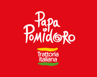
The client’s objective was to create a logo which would suggest a light and healthy cuisine, a warm and democratic atmosphere and friendly service.
The solution is a handwritten lettering for the logo, which emphasizes an individual approach to each client. The three colours of the Italian flag add a national touch to this graphic identity.
As seen on:
asgard-design.com
Status:
Client work
Viewed:
1282
Share:


Lets Discuss
Nice work.**The name of the place is wrong, altough I know this is not your fault, but Papa means Pope, meanwhile Pap%E0 is Daddy. And Pomidoro is not the tomato: the rigth spelling is Pomodoro.**Just if you want to tell to the client. **The handwritten name is nice so as the whole feeling, but the italian flag is gren, white and red, not orange, white and green as here.**If you want to discuss with me about this, feel free to contact me.*
ReplyThank you.%0D*This project has been made for Russia. Therefore the name has been changed to be convenient for Russian ear. I do not represent a flag, I use its colors (red, white, green). Yellow color simply additional here.%0D*
Reply@spasquini: I think he wanted to say %22Pappa al Pomodoro%22... %3B)
ReplyPlease login/signup to make a comment, registration is easy