Pawnfactory
by alexandreparageaud • Uploaded: Jan. 16 '13
Description:
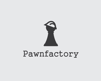
Logo for a board-games company.
Status:
Student work
Viewed:
2445
Tags:
factory
•
yellow
•
pawn
Share:
Lets Discuss
Love the concept, but maybe make the pawn look more like a pawn as it look more like a keyhole. Other than that brillant well done!
ReplyThe concept is great but i agree... get the piece looking like a pawn and you\'re on to a winner.
ReplyI agree. The hard hat as well. I know some come to a point on both ends, but I\'d round out the sharpness on the right side.
ReplyThanks for your comments! I will try to do my best.
Replygood simple and strong work ... and really inspiring !!! thanks for that !!!
ReplyThanks, I really appreciate
Replyloving the update. check mate!
ReplyPlease login/signup to make a comment, registration is easy