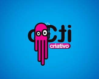
oCti Creative
by agencianove • Uploaded: Oct. 19 '07

Float
(Floaters:
0 )
Description:
Ok...I swear this is the last. I'm doing an animation with this logo and it will swim belive it or not!!!! Thank guys. No more oCti to you.
Status:
Nothing set
Viewed:
1292
Share:


Lets Discuss
Through all the changes I was there and I still love it! Believe it or not when you first posted the original (when I said it looked like Zoidberg) I was gonna say the O and C could be the eyes but I forgot to mention it. I'm glad you decided it yourself and I'm glad you stuck with the pink! Lots of edits later it still looks similar to the original which shows you were onto a winner from the start. But please no more revisions......
Reply%5E You're sure. No more revisions! Thanks men you're great as everyone else. I did love it and the result is this. Thanks.... I forgot who told me about the funny res. Anyways .gif works better for me than jpeg.
Replythe mark is really nice, just put the name in one line under it and voila %3B-)
ReplyCute and unique!*But logo type could go in one line under the octopus. It will be better?
ReplyPlease login/signup to make a comment, registration is easy