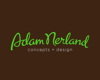
Adam Nerland
by adambomb • Uploaded: Aug. 20 '10

Float
(Floaters:
3 )
Description:
This logo has a very different feel when you take the frame away. Almost like a metal band. Not sure which I like better. Feedback please!
Status:
Nothing set
Viewed:
1643
Share:

Lets Discuss
Ik zeg deze, ik vind alleen de ondertitel wat raar lijken
ReplySorry, read it ery quick and thought it said 'Adam Nederland' (as in the country Netherlands), thats why I responded in Dutch.. anyways, I said: I say this one, only the tagline looks a bit odd
ReplyHa. Yeah, people misread it that way a lot, actually. The name is actually Norwegian.**Thanks for the feedback. Did you look at any of the other personal logos I've tried? (They're at the bottom of my showcase) I'm trying to decide what to use.**What do you think I should change about the tagline? Straighten? Further down from the name?**I love your personal logo, by the way. It's one of my favorites on the site.
ReplyI think this one is the strongest without the tagline. If you want to use the tagline I should incorporate it in your stationery and/or ads if I were you.**The last one in your showcase has potential too by the way I think, depends on how you work it out in your stationery/website**
ReplyPlease login/signup to make a comment, registration is easy