Izzygo Logo
by Zerflin • Uploaded: Jan. 24 '23

Float
(Floaters:
0 )
Description:
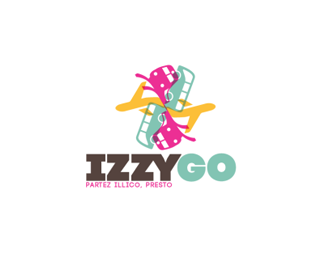
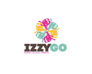
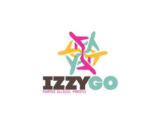
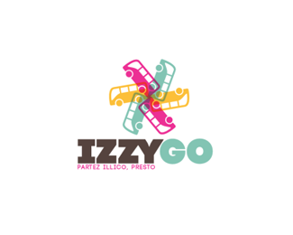
The Izzygo Logo was designed to be fun and inviting, to take the stress out of travel. The Mark was adaptable to the 3 main transportation options they offered, Train, Plane, and Bus.
Izzygo was a French travel agency concept by Marilyne Bilo designed to make travel accessible to everyone. With an emphasis on not just travelling to places, but having experiences there, the goal was to capitalize on short, bite-sized trips.
Status:
Client work
Viewed:
110
Tags:
brown
•
turquoise
•
yellow
•
pink
Share:
Lets Discuss
Please login/signup to make a comment, registration is easy