Epperson Appraisal
by VR4Jen • Uploaded: Jul. 08 '10
Description:
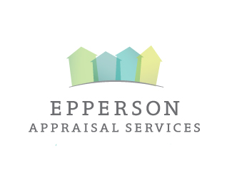
Home appraisal service... the houses double as arrows representing market values.
Status:
Client work
Viewed:
1149
Share:


Lets Discuss
Hey Jenna...just a suggestion: try reducing %22appraisal services%22 in size so the entire length is smaller and fits under %22epperson%22. Also move %22appraisal services%22 closer to %22epperson%22 so it's tucked under it. You can email me if you want..I can send you an example.
ReplyActually, mfrank, I respectfully disagree with your suggestion. The 'appraisal services' text does not need to be centered and reduced. That would compromise legibility. Doing that would also not help her design gain anything geometrically/balance-wise either. **For instance: the curve of the ground is a shape present that 'flows' better with the pyramid-like arrangement of the text. Therefore, in my opinion, the text goes well with the elements present in the design, and doesn't look 'detached' as a squared-off/justified approach would.
Reply%5Ewhichever works im not offended! just feels weird to me right now.
Replythis is a bit similar to this. http://logopond.com/gallery/detail/57516
ReplyGlad to hear, mfrank. As for that feeling of oddness....perhaps if the edges of the type followed the same angle or continuation of the curve present in the half-circle, that might speak better visually here. That would take a smaller adjustment, and would not compromise balance, legibility, or continuity.
ReplyThanks for all the input, guys.**I really didn't want to downplay the %22Appraisal Services%22 since that's what the company is about, not the name, thus the relatively comparable size of the two lines of text.**Here is the logo updated with two of the text suggestions: http://i27.tinypic.com/30niywm.jpg (the curved text is definitely not working, regardless of the severity of the curve). Is %231 an improvement? Unfortunately the business cards were ordered yesterday... maybe I can make a quick change.**ebrown: That is unfortunate. I originally had the arrows as just a house shape, but decided the corner angles were necessary to better indicate arrows.
ReplyJF, disregard that second logo, I totally misread your comment. Since the oval is so flat, the text has to be pretty huge to follow the curve, and Appraisal Services would be about twice the size as Epperson which doesn't look right. I think the shape continuation is suggested in the first logo though and after staring at it agree it is a more successful solution. Thanks.
ReplyPlease login/signup to make a comment, registration is easy