David Michael
by VERG • Uploaded: Jan. 26 '12
Description:
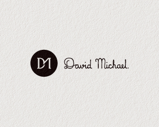
The clients request was for a "distinctive, fashionable, unique logo that evoked a designer image."
after creating the monogram my approach was to soften the corporate feel of the mark and balance it with an approachable signature style.
feel free to stop by and take a squizz at the presentation.
As seen on:
VERG
Status:
Work in progress
Viewed:
10898
Tags:
fashion
•
signature
•
circle
•
dm
Share:



Lets Discuss
I think this is very good idea.*I like the type, but my opinion is that it doesn't match with the mark style.*Monogram is nice, but could still be better. The M is not that well readable, mark looks like D1 more than DM. You can fix it by mirroring the upper side of D to form nice symetrical M.*Good luck!
ReplyHi Luka, thanks for stopping by and giving some feedback. I'm actually really fond of the relationship between the different styles for this. It might be an unorthodox approach and not the obvious one to take with the type but, for me this gives it a unique flavour and a sense of originality. With the monogram, i did sound board it amongst peers and there was never any confusion as to it being DM. I will take your suggestions on board as it may just further improve it. will keep you posted. thanks!
ReplyWhile it is fairly unorthodox, both pieces are really nice and compliment each other well. I definitely prefer this layout as opposed to the vertical, mark-above-type version.
ReplyThanks Sam, really glad you feel the same way.
Reply...and i agree the portrait is better. might fix that on the presentation to appear first.
ReplyPlease login/signup to make a comment, registration is easy