One Ocean
by TobiasGoth • Uploaded: Jul. 04 '08

Float
(Floaters:
1 )
Description:
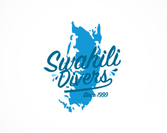
Logotype redesign for Zanzibar's biggest dive operator.
As seen on:
One Ocean
Status:
Nothing set
Viewed:
1821
Share:
Lets Discuss
the round ocean with its waves looks too much like a saw blade which makes this mark seem negative in my opinion.
ReplyI see waves good job
ReplyPlease login/signup to make a comment, registration is easy