Inequality Records
by SeanHeisler • Uploaded: May. 17 '09 - Gallerized: May. '09
Description:
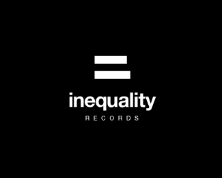
Unused concept, conceptual exploration. In case it's not obvious the two shapes of the "equal sign" are not equal.
As seen on:
Sean Heisler
Status:
Just for fun
Viewed:
19679
Share:



Lets Discuss
Very cool! The Helvetica looks beautiful. You might also try !%3D or %3C%3E as they also represent inequality in some programming languages. Cheers!
ReplySorry, forgot to convert to ASCII... You might also try %26%2333%3B%3D or %26lt%3B%26gt%3B as they represent inequality in some programming languages. Cheers!
ReplySmart and simple solution.
ReplyVery clever.
ReplyLove it! very clever but so simple.
ReplyHahahahaaaaa, clever one!
ReplyThis is great. It's the total package. great job!
ReplyThis is another way to visually display inequality as opposed to the everpresent icon %22≠%22 found all throughout math.**(the above %25u%23%23%23%23 code is a unicode character for inequality, or look below)**http://www.mathsisfun.com/definitions/images/inequality.gif
ReplyThanks, guys! I appreciate it a lot. Funny ideas for variations! :) he he
Replyat last. Today there are not sparks there are thunders here!
ReplyAlthough I hate people who use Helvetica, but in your case I will make an exception. *Great concept!!
ReplyThanks, guys.**satya %3E Why no love for Helvetica? It's will forever be the most perfect font! %3B) Seriously, I like it a lot, I love Swiss design, but I am very familiar with the fact that it's not considered a designer's first choice for many reasons. I typically do not use it unless it feels right. I don't use it in print design really at all. But as a typeface, to me, it's sheer beauty.*
ReplyYeah..I don't get the Helvetica haters either...this rocks!
ReplySimple yet smart solution, kinda has an illusion like feel to it or maybe am too sleepy. watever be it a very memorable one!
ReplyNice concept. I guess the economy is bad after seeing so many %22concept%22 and %22practice%22 logo submissions.
ReplyClever :) Gjob!
ReplyThanks, Jacob! Thanks for having my BarCode logo up on Logo of the Day in April. I just became aware of this a few days ago. Thanks!
ReplyWoa, simply amazing. I love it!!
Replylove the mark, very clever
Replysimply great!
ReplyThis is a very strong mark.. wow.
ReplyThanks a lot!
ReplyClever idea dude.
ReplyHaha this is sweet Sean! Don't know how I missed it.
ReplyThanks, Joe! Been meaning to go in and fix that equal sign, damn lines aren't the same.
ReplyLooks even on my screen :P
ReplyHa! Good, I'll leave it, then. :)**@plantingseeds - Thanks!
Replythis is pure genius...
ReplyThanks, man.
Replysuch a simple and memorable solution
ReplyPlease login/signup to make a comment, registration is easy