Corked Wine Bar & Steak House
by RobOliver3 • Uploaded: Jul. 13 '16

Float
(Floaters:
0 )
Description:
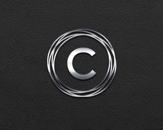
I began the Corked Wine Bar branding with drawing inspiration from a few bottles of wine. The inspiration for wrapping the letter “C” into four circles came from the aftermath of a napkin used as a coaster. I positioned the letter “C” inside the rings to resemble an open wine bottle, viewed from the top. Conceptually this may have been enough on it’s own, but I wanted to some more flare to the Corked Wine Bar logo. My thoughts were to design a minimal, integrated, corkscrew to take the place of the letter “E” in the word “Corked”.
As seen on:
www.roboliver3.com
Status:
Client work
Viewed:
1191
Tags:
Brand Development
•
Cork Screw
•
Initial Logo
•
Wine bar
Share:


Lets Discuss
Please login/signup to make a comment, registration is easy