NetMonastery
by Raja • Uploaded: Feb. 05 '12 - Gallerized: Feb. '12
Description:
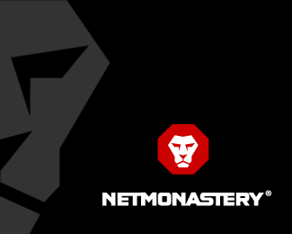
NetMonastery NSPL is the fastest growing technology providers for Security Operations Centers (SOC). Providing cutting edge business solutions for Log Management, Threat Detection, Security Management and Compliance, all delivered through one single window.
This logo was designed in partnership with Gareth Hardy [thank you]
As seen on:
www.NetMonastery.com
Status:
Client work
Viewed:
12254
Share:

Lets Discuss
what to do you think of the type? -- There isn't a consensus from the client side yet.
ReplyThink it goes nicely with the mark. Well done.
ReplyNice logo Nido
Replythanks?
ReplyDon't mean shit it
ReplyFont needs to be done and composition.*Nido, you're not a boy, just - it is necessary to do so
ReplySBdesign is on the bottle again LOL
Replyyeah, new bouttle:)*but....nothing:)
ReplyDon't mean shit it?*should not be - it,s correct translation**COOOGLE...mat' ego v eb
Replyeverisign all riht
ReplyYeah... Hehe. Thursday.
ReplyVensday
ReplyThe type has a great chemistry with the mark...whole thing looks as tough as granite.
ReplyStrangest comments I've ever seen. :)
Replylove the type as well as the MARK :)*nice work Raja :D
ReplySolid symbol and rockhard type - I like it very much - the one thing is that there are a lot of logos with the lion face in it.
Replyand I was thinking that I'm the only drunk at this site.
ReplyI especially like the lion mark - very strong, tough and simple lines.*Great work!
ReplyStrong, solid work here.
ReplyDope!
ReplyThis is an interesting thread to say the least.....
ReplyBeautiful design, Raja.
ReplyNice Symbol @Raja, type%B4s looking*good, like the ligatures.**@megashred13 Agree, what a discussion*lol
ReplyI don't know why... but something about the latter part of sbdesigns last comment has me nodding in agreement.
Replywhy are you in a pinch Nido?
ReplyI think sergey wrestles bears with one hand and writes poetry at the same time with his other hand
ReplyVery strong mark. The bold angular face of the lion evokes power and strength which is further establish by the use of the red octagon stop sign shape. The bold type matches well and hits on the secure vibe being portrayed.
Replynice design as well as the entertainment..
ReplyNice logo!
Replystrong as a stone! good work!
ReplyI Love Lions! Looks Great Raja.
ReplyRe: SB - I think Yoda has been on the bottle again?**Love the type Raja - fits perfectly for me %3D)
ReplyStrong, simple and beautiful.
Replykromberg logotivity garychew1984 ogomotive lefty peanut thanks!**SBdesign, see here: http://logopond.com/gallery/detail/152104 LOL
ReplyCheck out the complete logo rip-off here:
Replyhttp://www.behance.net/gallery/Techlion-Corporate-Branding-Project/8032209
Please login/signup to make a comment, registration is easy