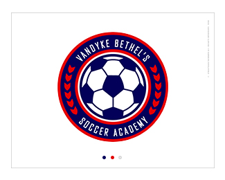
Vandyke Bethel's Summer Camp 2008
by Poster242 • Uploaded: Jun. 20 '08

Float
(Floaters:
3 )
Description:
Design for a summer soccer camp.
Status:
Client work
Viewed:
1588
Share:
Lets Discuss
The general concept/look is alright. I would try using a more modern font style as the one you're using feels a little dated. I would also try a version where you actually contain %22SOCCER CAMP 2008%22 in your shield shape - having it break out the way you do makes the logo look awkward. Finally, red and blue together tend to vibrate visually which makes the logo a strain to look at. Keep working on it.
ReplyPlease login/signup to make a comment, registration is easy