Sun Belt Conference v1
by NessMasta • Uploaded: Aug. 03 '11

Float
(Floaters:
0 )
Description:
With plenty of time on my hands and having finished the College Football Icons, I started a little project on an exploration of the Sun Belt Conference logo.
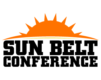
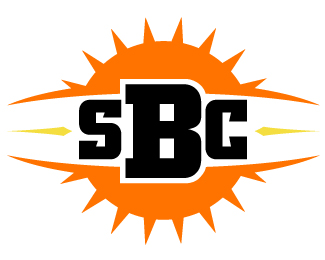
I believe a lot of folks know what the current Sun Belt Conference logo looks like, if not, here's a link to it (http://collegebaseball360.com/wp-content/uploads/2010/02/Sun-Belt.gif). To me, the logo is a bit too wordy and less visually.
So what I did in my exploration was to emphasize the Sun and something that could resemble some sort of belt around the star, and so the above examples was what I came up with.
My explored version is more visual appealing and doesn't rely too much on text, with the exception of the third one below where it's half-and-half. The left logo simply says "Sun Belt", while the right has the Conference's abbreviated name, "SBC". The third logo below is a little more visual and the text makes up the rest. I wanted the third one to have the full name of the league; however, I needed to take out the lower part of the Sun as it wouldn't look completely circular, but more oval.
And so, that's my little project.
As seen on:
JasonNessa.com
Status:
Just for fun
Viewed:
3989
Tags:
sports
•
sbc
•
sun belt conference
•
designs
Share:


.)
Lets Discuss
Please login/signup to make a comment, registration is easy