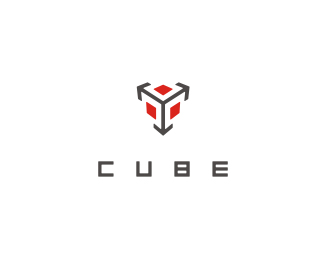
CUBE*
by Muamer • Uploaded: Nov. 12 '08
Description:
© Muamer ADILOVIC DESIGN // MA:DE
Status:
Unused proposal
Viewed:
7704
Share:






Lets Discuss
That's the one. Nice job!
ReplyI still wish those arrow heads followed the parallels better. Looking good though!
ReplyTry losing arrows altogether and __slightly__ enlarging red squares. That should look quite nice methinks.
ReplyMe thinks you should keep the arrows, follow paralees better as Glen suggested but taper them to a point? Make sense?
Replyparallels! got clumbsy fingers.
Replymethinks youthinks right, it should indeed look better with edges
ReplyOc, thank you :)%0D*%0D*@ gthobs, logomotive %26 epsilon: Hmm... maybe I will try %3E THANKS!%0D*%0D*
ReplyI still like the perspective on the mark as is. Makes the negative space of the cube a little more interesting. But those ideas could look nice too. :-)
ReplyOne of my favorite logos
ReplyPlease login/signup to make a comment, registration is easy