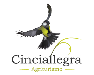
Cinciallegra - Agriturismo
by MDlogo85 • Uploaded: Jul. 13 '08

Float
(Floaters:
3 )
Description:
This is an other logo for Cinciallegra agriturism. Some day ago I created an other logo for the same reason and you can see it here: http://logopond.com/gallery/detail/34262
As seen on:
http://www.mdlogo.blogspot.com
Status:
Just for fun
Viewed:
2509
Share:


Lets Discuss
Very nice. Well balanced and interesting. Good job:)
Reply@ jenlogo: thanks for the compliment... and also for your feedback...
ReplyBird. It's what's for dinner!
ReplyI bet it tastes like chicken.**Probably not a good idea to have this little guy smack dab in the middle of a plate.
ReplyJenlogo, no offense, but I don't find this well balanced at all. There's no solid concept - it's just a mish-mash of different graphic elements thrown together. And there's no consistency in illustration styles - some elements are flat and nondescript, while others are very detailed. **In my opinion this definitely needs reworking. Sorry.
Reply@ Lucidity: yes it's a bird, because the agriturism is called Cinciallegra*@ gthobbs: I put the bird in the middle of the cicle to emphasize the fact the the agriturism is called cinciallegra... *@ sdijock: For me the match of different elements it's good... but this is only my opinion. I think that the only detailed element are the leaf of ivy but I try to put it without the detailed and it isn't so good...**@ everybody: thanks for the comment and for the feedback... it's important for me... I try to improve my self and your comments, bad or good, are really important for me. Thanks...
Reply@ sdijock, why does it sound like your comment was made for me? Everyone has a right to their own opinion dude, take it easy.
Reply@ jenlogo: no no no... probably I wrote in a bad way what I would say... I don't draw logo for work but only for hobby... so I have so much to learn from you and other designer... If your comment was a bad one, I'm happy because I must learn something...*In my last comment I would say that for me the logo was good, and I would know better why you said that it isn't so...*Thanks...
Reply@ jenlogo: oops sorry I didn't see that your last comment is for sdijock...I tought that comment was written by sdijock for me and not by you for sdijock... I'm sorry!!!
Replyjenlogo - I never said you didn't have a right to your own opinion. I just noticed your statement about how %22well balanced%22 this logo was and MY opinion is that I disagree with YOUR opinion. I wasn't picking on you, just merely pointing out the flaws in your comment and the logo.**Now, would you prefer a tissue or a hug? **
Reply@ Relevant: Really really thanks for the comment... I'll try to improve my logo...
ReplyYou got too much going in here, get ride off some distracting elements and just leave those who you really feel that communicate your idea, I feel it more related to a restaurant than to agritourism.That's the problem when we leave all the work to the computer, you got to practice over and over again, sketch, sketch, sketch, is not all about the illustrator vectorizer tool.
ReplyHi sdijock, there are no %22flaws%22 in an opinion, it's a very personal and completely subjective thing. In my dictionary %22balanced%22 means arranged in good proportions or an even distribution of weight, which mdlogo85 accomplished very nicely. Sorry, it just sounded to me like you were going off on a rant. No hard feelings, and thanks, I don't need a tissue OR a hug!! lol
ReplyI'm all about opinions being subjective but I actually would have to agree with sdijock here. I think your opinion is flawed because it's not based on sound design principles. For instance you say %22In my dictionary %22balanced%22 means arranged in good proportions or an even distribution of weight, which mdlogo85 accomplished very nicely.%22 He didn't accomplish balance per your very definition. But that's just IMO.
ReplyThanks Climax :)
ReplyThanks to everybody. You have given me good suggestions. I regret that my logo has instigated so many discussions among the most experienced designers, it was not my intention. I have a lot to learn, and I hope that the my next logos pick up as many useful comments. *Thanks.
ReplyClimax - my %22tissue or a hug%22 comment was to add a little levity to the situation, which accomplished exactly that by jenlogo's lol response. Read all my comments, there was no personal attack, rather, I was initially addressing jenlogo's comments directly.**Didn't mean to offend anyone.
ReplyPlease login/signup to make a comment, registration is easy