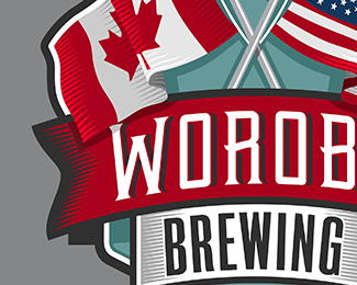
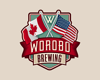
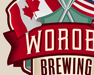
Worobo Brewing
by LuBeraDesign • Uploaded: Mar. 17 '16

Float
(Floaters:
4 )
Description:
Logo designed for a local hobby brewer who wanted to reflect his American and Canadian heritage.
Status:
Client work
Viewed:
1299
Tags:
illustrated
•
badge
•
brewery
•
flag
Share:


Lets Discuss
I don't want to really 'drum up' commenting on this one, but I feel it's pretty decent piece of mine and I notice it's not getting much attention - I'm very interested in thoughts in general and in comparison to my other work - what doesn't work with this on and thoughts on how it could be fixed?
ReplyCritical feedback appreciated!
I'm no expert in your style lubera its really unique and very illustrative. This just doesn't have that style like others like secret path, frontagers, cloud hugs etc. Personally this is why this not a very good piece not enough detail and not enough of your signature style without a concept. that those other logos tell a story within them with a their illustrative feel and have concepts to support to them. Making them stronger, citizens food brings to mind the various spoons each person contributing while it just a illustrtative logo it has a concept to make it stronger added with your expert detail work makes for awesome logos. Adding to that I'm very much interested in trying this style of logos could you give me some advice is it just illustration skills?
Reply@Supamario
ReplyThanks for your feedback! I think it is very accurate. This one definitely called for a cleaner and 'less-signature' style for labeling. It's actually quite detailed but in a less obvious and hand-done way. I was hoping to bring off that rare 'simple complexity', maybe I fell short. It's not my typical thing, so I'm very interested in opinions.
I guess it goes to show that sometimes it's still hit and miss. I can usually gauge the quality of my work, I guess I over-hyped this one to myself. :)
As for advice, it's hard to pinpoint how I developed my 'style'. I would say that sometimes it allows for me to be more 'literal' about the subject matter and concept. I would say become comfortable with line art and pen shading, and then apply those to an already creative concept. And don't be afraid to micro-analyze!
Please login/signup to make a comment, registration is easy