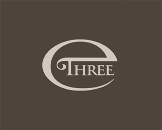
E3 v2
by Logomotive • Uploaded: Jan. 17 '08

Float
(Floaters:
7 )
Description:
I was asked by a design firm to create just an E3 or e three mark. In this design I used the same shape to create the E and 3. This one was a bit too modern for the requirement ( they were looking for more classic) but thought I would add it here for inspiration, Might help someone working with E's 3's or B's or just make something click.I had a lot of fun doing these.
Status:
Nothing set
Viewed:
3323
Share:


Lets Discuss
Very cool. Thought Dache had changed his color scheme :)*
ReplyI'm not sure if that was a compliment or not.
Reply@ KGB, LOL yeah who knows? maybe it's the style of the logo does kinda look dachish I guess. As far as color well just being different with that.
ReplyLMFAO! I have to clean my monitor now that Dr Pepper is all over it! Thanks Alto!
Reply...scratching head?*
ReplyNice shape, weird colours : ) I like the E3 shapes.
ReplyThanks guess I was in a weird mood, they are actually complimenting colors to each other. I liked the uniqueness.
Replyyou have mastered the swiss style!.. %3B-)
ReplyBut I'm american/swede :-)
ReplyIt is unique and to be honest I start to like the colours ! : )
ReplyLOL... so now we're talking three different countries... anyone for a Indian?
ReplyThe colours are in deed weird, but that was what caught my attention. First I thought they vibrated, but as time went by, I started liking combination.
ReplyPlease login/signup to make a comment, registration is easy