Big Visible
by Kode • Uploaded: Dec. 20 '08

Float
(Floaters:
1 )
Description:
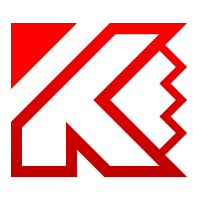
Rebranding proposal for Big visible. They're a small company providing "agile software development training" among other things.
I wanted to integrate the letter "B" + "A Wise Owl" to create an iconic figure that was approachable but would get the message across.
Feedback would be great guys!
As seen on:
Kodespark
Status:
Nothing set
Viewed:
1517
Share:
Lets Discuss
I didn't really see the owl, but more of a mask. Maybe straighten it out and/or work on the eyes to make it a bit more owly.
ReplyI agree with you *quson*, I didn't think the mark was %22owlly%22 enough. I have updated the image after another iteration working on the eyes.*I am not completely happy but I think it was a step in the right direction.**Thanks for your feedback!
ReplyDefinitely an improvement, but I'm still not sure I'd see an owl without knowing what I was looking for. Sharpening it up, playing with colors (doesn't need to be brown, see link number two below), or adding some sort of feather texture all might help. I googled %22owl mask%22 and found quite a few images that might inspire:**http://tbn3.google.com/images?q%3Dtbn:AFs3D5ZqjjkuBM:http://www.skinbase.org/files/archive/shots/308/OwlMask.jpg**http://tbn2.google.com/images?q%3Dtbn:qH6uFoWz4wph0M:http://www.jasperjohns.co.uk/images/01owl.jpg
ReplyThank you so much man!*When doing research for this project I looked at about 200 owl images and it was important to me that the letter *B* was still present and readable, so it had to be subtle and simple.*Your feedback and research has helped me a lot!***Updated*: This iteration addresses the issue of the mark looking more like a mask rather than an *owl*. I added a bit more owl shape to the face, everything else stayed the same. I think this is the most I can get away with before the *B* starts to disappear from the concept.**I would like to hear your thoughts!
ReplyThe round eyes are my favorite yet, and it feels much more %22birdish%22 overall. I still see the B, too, but not so obviously as before. I'm not sure how important legibility was with that, but I like it as sort of a hidden design element. And just out of curiosity: was the angle on the face just to make the B more readable?
ReplyThanks *quson*!*The angle of the mark came to me when I was trying different layouts for the brand after I had sketch the *Owl within the B*. The client wanted something different with a fresh arrangement and the legibility of the %22*B*%22 was a bonus I discovered while doodling on my sketch book!**I think your help has been paramount to the achievement of the current logo, and I want to tank you for that!**Anytime you need some feedback on any of your projects let me know bro!
ReplyGlad to be of assistance. It's always easier to serve as critic than creator, though. **Anyhow, I hope the client likes it. I might have to take you up on your feedback offer someday. I'm currently working on my personal logo, so it may be a while before I get a paying customer. If you want my thoughts on anything else: brad@druckenwell.com.
ReplyI would be happy to help you out, you can find my email address at the bottom of %22My Profile%22:http://kodespark.com/profile page on my site.*I just recently finished working on my brand and many designers here, helped me out a lot!*And don't worry, it won't be too long 'till you start rolling out some paying logos! I was kind of afraid to go on my own after working for a design agency that paid me well:-) but freelancing is the best decision I ever made!
ReplyPlease login/signup to make a comment, registration is easy