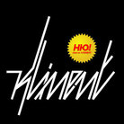
PROUD ambigram
by Kliment • Uploaded: May. 21 '10

Float
(Floaters:
2 )
Description:
PROUD started as a personal project. It appeared that Proud magazine used the same idea for their logo. Great minds think alike, hehe
As seen on:
here
Status:
Just for fun
Viewed:
1582
Share:

Lets Discuss
This has potential to be good, but I feel it's lacking in execution. The slant angle is too large (maybe not necessary at all). The inner effects just complicate things and aren't necessary. You could also probably get away with splitting the r/u from the o and still have it read fine.
ReplyYes :) I agree ... but I've dropped this one already because of the obvious similarity with the PROUD mag logo.. :)
ReplyPlease login/signup to make a comment, registration is easy