TH Designs
by JustTomTom • Uploaded: Sep. 06 '11

Float
(Floaters:
0 )
Description:
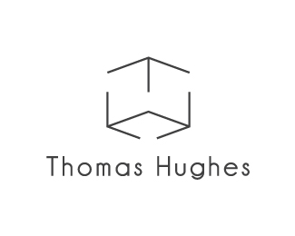
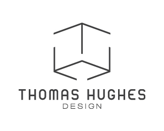
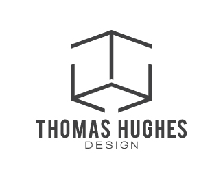
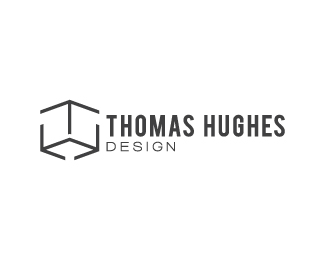
I'm just trying to sort out a personal identity mark for myself as a designer. This is an updated version of this idea that uses a box that forms my initials, but also plays a little on the general 'outside the box' way of thinking. Unsure on type.
Status:
Work in progress
Viewed:
2777
Tags:
Idea
•
Thinking
•
outside
•
Box
Share:


Lets Discuss
May include another channel:)
ReplyJazz can be gently asked ?...http://www.sky.fm/play/smoothjazz247**Thanx Thomas****
ReplyI think sky.fm has a new spokesperson! %3B)
ReplyI'm really confused right now.
Replyhaha, we all usually get confused when sb starts posting...**All I can tell you is that my post was in response to him because he had posted a bunch of these sky.fm radio channels on a lot of people's logos last night.**In regards to your logo, the H is a little tough to see at first, but I'm not sure that that's a bad thing just yet. I think no matter the case, the weight of the main type (your name) should be the same as the weight in the lines of the mark above it. I'd then bring down the point size of that main type. Forget the central line made out of the I in designs, it just confuses the eye and distracts from the main mark. I would bring down the point size of 'designs' quite a bit, giving it some space away from your name. I would even try moving all of the type to the right of the mark, with designs left aligned.**I would also seriously consider changing it from 'designs' to 'design'. If design is your career, then it is a profession%3B a practice. Not a set of products.
ReplyAhh right. When I first saw that link I was worried he was pointing out that somebody else already did a similar idea/design. Phew!**Thank you so much for the detailed crit! That's plenty for me to work with and hopefully improve the design :). I did try a few things to make the H easier to read such as stretching the cube a little higher or increasing the gaps, but like you said I don't think it's too much of an issue as it is.**Hahaha! Interesting how drastic a change a single letter can cause. I never thought of that.**Thank you again for all that! I'll try out what you said, see how it looks and post a revised version.
ReplyPlease login/signup to make a comment, registration is easy