Retroware
by JedahDoma • Uploaded: Nov. 22 '17

Float
(Floaters:
1 )
Description:
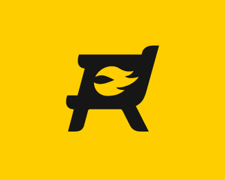
The owners of Retroware, creators of 'The Video Game Years' wanted something that implied the idea of video games from the past. I felt the 'R' letterform worked perfectly as an arrowed shape implying looking to the past while the diagonal motion made it an upward and hopeful feel.
There were many versions created until this one was settled on. Even though I think it turned out well, there were other versions of the logo I preferred and felt were better. More specifically I felt the pixelated style of the logo was a bit too forced and did not need to be included in order to get across the spirit of the logo. However it is a case of working with your client to make the best out of their wishes.
As seen on:
Retroware TV
Status:
Client work
Viewed:
677
Tags:
video games
•
retroware
•
retro
Share:

Lets Discuss
Please login/signup to make a comment, registration is easy