Heavy Rotation
by Fux • Uploaded: Jun. 28 '09
Description:
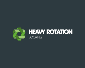
Logo proposal for a urban booking agency.
Status:
Unused proposal
Viewed:
1410
Share:


Lets Discuss
nice symbol! but defenetly needs some kerning adjustments. the letters are waaay too close, especially in %22booking%22..
Replythe mark is pretty cool, but it it seems to need some tweaking. where the triangles intersect it seems odd that there is a little notch of one triangle into the other, instead of having one triangle cleanly go above and under the other triangle. and the kerning does need work, especially %22booking%22
ReplyPlease login/signup to make a comment, registration is easy