Peking Duck Updated
by Chanpion • Uploaded: Sep. 21 '07

Description:
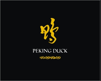
The owners of this restaurant have refurbished and gone a little bit upmarket. They also requested an identity revamp. The mark is Chinese calligraphy for 'Duck' which I scrawled using the traditional calligraphy brush. Then scanned and vectored.
Status:
Nothing set
Viewed:
3652
Share:


Lets Discuss
Why not refer to %22Peking%22 in the symbol?*What is the reason for those glyphs under the type? It does not seem to be homogeneous with the rest (perhaps too european).**The image is 2 pixels too short %3B%5E)
ReplyHey dache. Hows things? The emphasis on the 'Duck' as opposed to Peking is simple. This little establishment has gotten so popular that locals refer to it as 'The Duck'. Strickly speaking, it should be called Beijing Duck but in this instance, Duck had more significance to Peking. As for the 'glyphs', they too were scrawled using the same brush and were inspired by a section in the framework of a Chinese mural hanging inside the restaurant. Maybe Mr M Polo 'imported' more than just spaghetti from China back to Europe?
ReplyThx David. The P and D was very very subtle. Glad you picked that up. I didn't want to make it too traditionally Chinese because it had to fit in with the decor of the restaurant which is very Asian fusion. This is still WIP so I might tweak the type abit more for legibility. Cheers.
Replyoh...and also, the right part of the mark resembles a flapping duck. Once again, very subtle.
Reply%22P%22 and %22d%22 rather %3B%5E)
ReplyLovely ... not finding the design at the bottom out of place at all ...
ReplyThis is absolutely beautiful.
Replyawesome skill dude... makes me want to order some beef satay.. know what im saying?!?!
Replylove it, i would just get rid off the bottom yellow bit tho.
ReplyI, too find the type and flourish at the bottom a little odd. I don't think it's as much what they look like as it is their size. The strokes in your main mark (which look fantastic, by the way) are quite thick, which completely overpowers the rest, to the point where they look out of proportion. Perhaps try playing with the sizing?
ReplyExcellent work.
ReplyPlease login/signup to make a comment, registration is easy