300Gaming
by CKeil • Uploaded: Jul. 05 '08

Description:
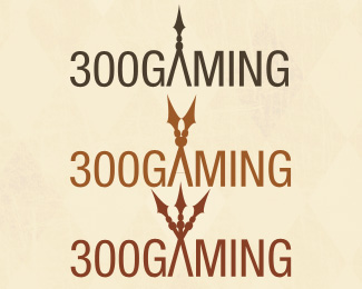
Still in production, lots of indecision on the client's part, but I still don't know which version I like the best.
Status:
Nothing set
Viewed:
925
Share:

Lets Discuss
Personally, I like the center most, because it makes more sense. It looks like 2 spears. The other ones look weird, because there are more spear heads than handles.%0D*%0D*Just my opinion.
ReplyCenter for sure. But I think you need more dynamic typo.
ReplyThanks guys! gthobbs, what do you mean by dynamic typo? Like differences among the letters, or more difference in general?
ReplyI mean that the Helvetica or whatever your sans serif is feels a tad generic here. The font could use a bit more character that lends itself to the look of the spears.
ReplyThanks for the feedback gthobbs- I totally agree. I'll post once I have more time to revise this logo.
ReplyPlease login/signup to make a comment, registration is easy