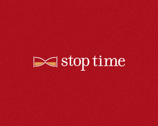
This is a really interesting take on the name \'stop time\'. However I\'m curious to know why a watch company would adopt this name? Surely their main objective is to ensure that time continues to tick over for their customers?
Yes you have right about the main objective of a watch company, but it\'s a stop watch company, a regulator device so that was the idea which I start from.
Thanks again for the hint Dan, I really appreciate your feedback.
AlexWende - They like this icon, I gave them the an iteration for the font and I am waiting their final feedback


Lets Discuss
This is a really interesting take on the name \'stop time\'. However I\'m curious to know why a watch company would adopt this name? Surely their main objective is to ensure that time continues to tick over for their customers?
ReplyYes you have right about the main objective of a watch company, but it\'s a stop watch company, a regulator device so that was the idea which I start from.
ReplyCool idea
ReplyThanks Dan and Alena, you are very kind
Reply\"it\'s a stop watch company\" - well in that case the name is fine. :) Maybe you should include this information in your description?
ReplyGreat concept here! In my opinion the execution could be a bit more modern/iconic and stronger (if it fits the brief)
ReplyThanks again for the hint Dan, I really appreciate your feedback.
ReplyAlexWende - They like this icon, I gave them the an iteration for the font and I am waiting their final feedback
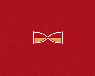
Very cool concept. But definitely agree with Alex; this could be a killer logo
ReplyBtw that glass shade is not necessary imo.
Replythanks t-sovo for tip, I\'ve erased the glass shade
ReplyPlease login/signup to make a comment, registration is easy