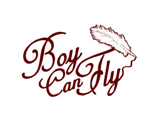
Boy Can Fly
by BoyCanFly • Uploaded: Nov. 16 '07

Float
(Floaters:
22 )
Description:
Self Promo, Alter ego
Going for rough draft feel.
Another type logo to follow that will act as a replacement when needed for smaller printing.
Status:
Nothing set
Viewed:
3220
Share:


Lets Discuss
I like the feel of this. Good job and best of luck!
ReplyThanks rfrusso... I have been working on this now for 3 years trying perfect it. Especially in regards to the concept of cardboard wings shedding feathers. I am really hoping to get some feed back from more people. Thanks again for the kind words.
ReplyHi- don't have too much to time to critique - but overall feel is great in this logo - can't forget it
Replyi think its great BUT i think it would add more humour if he was still on the ground. it looks more like he's levitating at the moment.**i think the 'belief' of flying has a much stronger image than actually doing it with crappy wings (that aren't moving).
ReplyI was trying to convey belief in yourself can make things you felt impossible, possible. I choose to make him levitate instead of flapping because flapping comes off as arrogant like %22 I know I can fly%22 instead of believing and finding that your feet are no longer touching the ground. As in the story about the Little Engine that Could %22I think I can, I think I can%22 ...if that makes sense :)**But seriously thanks for the comment I appreciate it a lot! Food for thought.
ReplyGreat stuff...detailed and iconic! Love the idea, well done!! :)
Replyhaha. great style!
ReplyThis is Gallery quality logo, top notch execution!
ReplyExcellent work! Floated :)
ReplyI think this deserves far more than 19 floats :)
ReplyPlease login/signup to make a comment, registration is easy