Right Step Limited
by Bitencourt • Uploaded: May. 30 '11

Float
(Floaters:
30 )
Description:
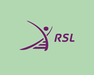
Logo using RSL and the concept of 'right step'. I'd love to receive your feedback here :)
Status:
Work in progress
Viewed:
4005
Share:


Lets Discuss
I think this is more than a little brilliant.
Replyconcept is great but a bit slippery
ReplyThank you guys, I have tried something new here. :)
ReplyBreno, really dig the concept feel it's too busy now. What about more of a Base for the steps with a 90 degree angle and lose the roundness there? I think more solid patches will bring the concept out better.Just my 2 cents.
ReplyThank you Mike! I'm thinking the same about it looks too busy. I'm liking the version i did here without part of these graphics, will share here soon. :)
Replyvery different
ReplySomething new, indeed. That%60s why it is hard to accept. I absolutely love it!
Replyamazing work -- love it !
ReplyLOVE this concept, but I agree with the others. It's close, but could benefit from a bit of tweaking. Mike's suggestion is a good one. I DO love the overprint effect, as well as the fact that it actually looks screen-printed on a sheet of heavily-textured paper.
ReplyPlease login/signup to make a comment, registration is easy