Ruggard
by Bitencourt • Uploaded: Sep. 15 '10

Description:
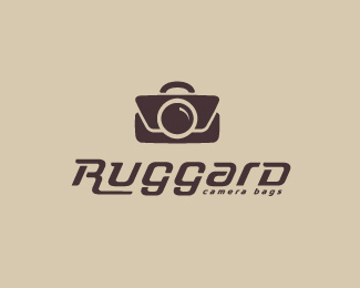
logo study for a camera bags brand, inspired by 'american style', the concept is clear? i'm looking for critiques.
Status:
Work in progress
Viewed:
2379
Share:


Lets Discuss
Thanks for the tip, Alen. I have tried, but i think the camera idea is not pretty much clear/evident...
ReplyI agree with Alen's comment. Also make the stroke the same all the way around the lens as you do for the crease portions.
Reply%5EI agree with the depth of field Tony, but for aesthetics of the mark I think it would be best for same stroke width.
ReplyBoth good point about the stroke, but I agree with Joe.
ReplyWhen I decided to leave thicker, I had thought like Lane. But even so I did a test with the same thickness.*It's already very hard for me to decide cuz I'm seeing it a few hours, I can no longer distinguish anything else haha.
ReplySurely Lane. You're absolutely right. Thanks everyone :)
Replylove the type, Breno.
ReplyThanks Big :)
ReplyWow! Great! It totally reminds me of a vintage leather camera bag.
Replygreat work man, but i just can help not to mention the mark isn't center aligned.
ReplyPlease login/signup to make a comment, registration is easy