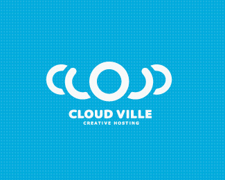
Cloud
by Bitencourt • Uploaded: Aug. 13 '10

Float
(Floaters:
32 )
Description:
Logo study for a internet-based service for individuals securely store retrieve and share your personal digital files.
Status:
Unused proposal
Viewed:
3325
Share:


Lets Discuss
Your work gets better and better. This is cool.
ReplyThanks Guys. **@Kevin really means a lot, man.*Look at works from designers like you is making me a better and better designer! Thanks a lot! :)
ReplyGreat idea. Good work man.
ReplyThis is nice
ReplyThanks MFrank and !Mude :D
ReplyAwesome! Good idea
ReplyThanks Claire :)
ReplyFinal proposal, with type. Thanks for comment :)
ReplyGreat job, Breno!
Replylooks very nice man, but i don't really get the diagonal lines
Reply%5EIs it a watermark to deter theft?
ReplyLooking good Breno. *Except that letter %22e%22. Looks a bit heavy against %22m%22.
ReplyHmm, good take Rokac. Thanks! i will repair :)**Hahahs, no its not a watermark to deter theft, just a cool layout :P
ReplyI'm on cloud 9 looking at this. Nice work BB.
ReplyHey Thanks JP! really means a lot :)
ReplyClose the space a little between U and D Breno :)
ReplyHey Breno I would like to see this plain or just with gradients. I think it could look better, can you provide some link for me to see it? %3B)
ReplyOf course, Milosz! just a minute, buddy...
ReplyMilou, take a look %22here%22:http://logopond.com/gallery/detail/113556 i'd done the type adjustments too :) Thanks JP and Rokac!
ReplyWith and without the lines this, this is the shiz.
ReplyGreat one, very smart!
ReplyThanks Milou and dadado, means a lot! :)
ReplyThe client reject this proposal. :'(
Replyinsane...(the logo %26 the client)
Reply%5E Hahahs. Thanks mate!
ReplyUpdated! :)
Replynice job ...
ReplyThanks James! really means a lot.
ReplyHey, i missed this one great work. Love your work!!
ReplyGreat work.
Replycool
ReplyNice cloud*
ReplyWhen you see this logo small, it looks great too, great job Breno.
ReplyPlease login/signup to make a comment, registration is easy