ON!AD
by ArtisticRuby • Uploaded: Nov. 06 '14

Float
(Floaters:
0 )
Description:
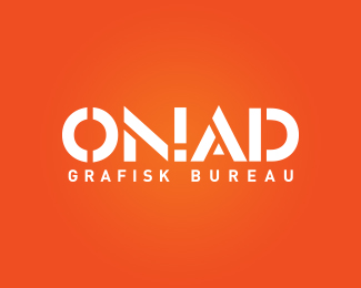
I was an intern at graphic bureau on!Ad and got a chance at redesigning their identity.
They produce a lot of print inhouse and the majority of the work is offline. They specialize in big formats and will print on anything. This means the logo has to be designed for use on various media and sizes.
I paid much attention to the middle, due to the fact the logo has to emphasize two things: The exclamation mark within has to be clear and visible, since it is from the old logo. It cannot take too much attention however, because ON!AD as a whole, has to be readable too. Combining these two criteria with the natural anatomy of letters was a tough nut to crack, because the anatomy dictates the placement and angle of the cuts.
The 'O' and 'D' rounds out the logo and with the exclamation mark in the middle, the logo becomes harmonic and 'symmetrical'.
The white space makes sure the exclamation mark is noted while adding som edge.
Logo is registred and in use by client.
As seen on:
My portfolio
Status:
Client work
Viewed:
1292
Tags:
•
ad
•
on
•
mark
Share:


Lets Discuss
Please login/signup to make a comment, registration is easy