well, i guess it's mainly the color that reminds one of the wunderkiddo logo... and that lock of hair, maybe%3B I wouldn't challenge its unique-ness, though. Looks great and transports the idea well.
I am sorry, but this feel a bit more than just inspiration... Hair, eye, rounded square, colors... please revise... it really feels strange seeing it sitting here.
Hey, guys, i'm shoked, what are you talking about? This mark is similar, but not the same. Logoholic, if you just want, I can change the colors of this. I realy didn't see your wunderkido, before I create my business expert.
Alexita, i know that it happens sometime to create something that already exists, but there are two main reasons why i am asking you to remove/heavily revise your take on my logo: 1. I am really attached to it! 2. It got ripped too many times before and i am a bit sick of it. Like i've said hair, rounded square/face, eye and mouth play and especially color combo - too much my friend, too much... Let David decide afterall..
yeah no disrespect logoholik, you know i got nothing but love for you, but i think this is no longer close enough to warrant any kind of rip. other than the wunderkiddo logo designer himself, and a small group of very astute logo designers, i cant see anyone in the general public or legal sphere making the connection between these 2 logos. for the record, im pretty liberal with logos duplicates, since i think if we take the trademarking territory too far, we will end up with a bunch of designers afraid to make any mark that isnt a homerun original drawing. nearly impossible in this day and age with thousands of logos being cranked out daily.
for me this good. I would like to see you take it even a little further from the Wunderkiddo logo, but I personally like the way you handled the hair as you did.
Sorry, but this logo doesn't seem to do well for the company it is imaging. First off, the hair makes it look childlike and the %22profile%22 view of the face looks strange with the straight on view of the tie.
Well, thank you for your comments, positive and negative. First of all I'm pleased that this sign interesting to others, some people see the baby with a tie, or a 'profile' face, the other see only that this is quite a nice logo, and others compared it with the another one, when there are no similarity at all, except square head, but it is not already such a unique idea... %0D*However, thank‘s for your attention!%0D*I wish you and myself, less situation when you created something similar to what has already been created! Believe me, very unpleasant feeling!%0D*

Lets Discuss
I instantly thought of..*http://logopond.com/gallery/detail/42366
Replywell, i guess it's mainly the color that reminds one of the wunderkiddo logo... and that lock of hair, maybe%3B I wouldn't challenge its unique-ness, though. Looks great and transports the idea well.
ReplyO dear,%0D*John, you are right! It is similar to logoholik’s sign, but as you know %0D*ideas fly in the air :)))%0D*
ReplyThank's, Roland!
ReplyI am sorry, but this feel a bit more than just inspiration... Hair, eye, rounded square, colors... please revise... it really feels strange seeing it sitting here.
ReplyYa this is pretty much wunderkiddo with a slanted face and a tie.
ReplyHey, guys, i'm shoked, what are you talking about? This mark is similar, but not the same. Logoholic, if you just want, I can change the colors of this. I realy didn't see your wunderkido, before I create my business expert.
ReplyThank you, nima!
ReplyAlexita, i know that it happens sometime to create something that already exists, but there are two main reasons why i am asking you to remove/heavily revise your take on my logo: 1. I am really attached to it! 2. It got ripped too many times before and i am a bit sick of it. Like i've said hair, rounded square/face, eye and mouth play and especially color combo - too much my friend, too much... Let David decide afterall..
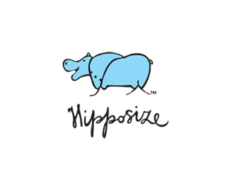
ReplyOk, now ditch the hair and everything's ok :)
Replywhat if he moved the hair down like bangs? still too close?
Reply%5E it'd be %22Goth Experts%22 then.**It _is_ very close to Wunderkiddo logo. Very.
ReplyI changed the hair tipe, so, finaly it's not similar to wunderkido!!! I hope, everyone will be happy! hurrah!%0D*
Reply%5E yeah it's now wunderbaby with tie on :) nevermind, i am over it :)
Replyyeah no disrespect logoholik, you know i got nothing but love for you, but i think this is no longer close enough to warrant any kind of rip. other than the wunderkiddo logo designer himself, and a small group of very astute logo designers, i cant see anyone in the general public or legal sphere making the connection between these 2 logos. for the record, im pretty liberal with logos duplicates, since i think if we take the trademarking territory too far, we will end up with a bunch of designers afraid to make any mark that isnt a homerun original drawing. nearly impossible in this day and age with thousands of logos being cranked out daily.
ReplyI really don't get this logo. I see a neck tie but what is the face meant to be?
Replyfor me this good. I would like to see you take it even a little further from the Wunderkiddo logo, but I personally like the way you handled the hair as you did.
ReplySorry, but this logo doesn't seem to do well for the company it is imaging. First off, the hair makes it look childlike and the %22profile%22 view of the face looks strange with the straight on view of the tie.
ReplyWell, thank you for your comments, positive and negative. First of all I'm pleased that this sign interesting to others, some people see the baby with a tie, or a 'profile' face, the other see only that this is quite a nice logo, and others compared it with the another one, when there are no similarity at all, except square head, but it is not already such a unique idea... %0D*However, thank‘s for your attention!%0D*I wish you and myself, less situation when you created something similar to what has already been created! Believe me, very unpleasant feeling!%0D*
Replyoh, thank's, Moni, for a compliment, girls-designers are always glad to hear it%0D*:))) Sooooo, and thank's for your advise!
ReplyQuirky and very cool... almost uber cool!
ReplyThank you! %3B)
ReplyYou guys are ridiculous. I could take EVERY logo in this gallery and find one with similar design aspects, chill out!
ReplyIt reminded me of http://incspring.com/brand_details.php?brand_id%3D280%0D*%0D*Just kiddin' %3B)
Replyi haven't seen the old logos yet. but this current one is good. I like it
Reply%22http://www.vipinashok.com/%23workLink%22:http://www.vipinashok.com/%23workLink This individual is stealing your work. Check the logos link.
ReplyPlease login/signup to make a comment, registration is easy