travelgroup
by AlexWende • Uploaded: Mar. 12 '10 - Gallerized: Jun. '10

Float
(Floaters:
72 )
Description:
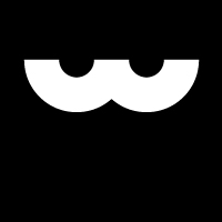
travelgroup.com is an upcoming lifestyle and travel social network.
The 4 echeloned colors symoblizes the people and the nature like sun, sky/water, woods/botanic and the earth.
Status:
Client work
Viewed:
29814
Share:
Lets Discuss
This is very nice looking Alex.
Replycool mark :)
Replyvery lovely looking. just wondering if people would associate it with 4 RSS symbol instead.
Reply%5E You mean like this one? http://brandstack.com/logo-design/details/17376
Replyi also thout i saw this somwr...but i ges double u and alex are the same felozz.:d
Replythat's fresh, man, nice work
ReplyNice work Alex!
Replygood mark!
Replycircles confined by a square, a very strong mark my man
ReplyImpressive mark!
ReplyNothing wrong with the mark. . . but I feel like I've seen logos like this over and over. Gallery-worthy?
ReplyI dont get it, its the same person, why should it be removed?
ReplyFirst, I'm pretty happy thank you for the gallery spot! 2nd Actually most of the logos I've uploadet on Brandstack are unused proposals, I rework them more or less and try to sell them. This one was for a local network service, unfurtunatly he headet for an another designer like me. (that's how it goes sometimes...)**@nrcreative: I'm really interested why you think it's a generic logo?
ReplyForgot to mention that I think the client have bought the right logo for his service. It will be a lifestyle and travel social network like www.wayn.com
ReplySweet logo. Simple yet very effective and memorable.
Reply@Alex - I was thinking I'd seen that identical mark, as it turns out it was you that made it. So no worries there. And maybe it's me, but all these abstract, multicolored marks are starting to look the same. I guess it seems like a fad.*But I love most of your work, you have a very impressive showcase %3B)
Replythx koodoz :)**@nrcreative: Oh. I was not offendet, just curious! :) There are companys out there which have services that are complex %26 multifaceted and where an abstract logo is an appropriate decision. I know what you mean, but I think the colours here have the right to exist, since they have a meaning and are not just for the Eye Candy. imho Thank you for the feedback! %3D)
ReplyIt's nice that you found a home for this logo. Kudos.
ReplyVery good tones in this sign!
Replythx guys %3D)
ReplyLooks like RSS icon made 4 times :) But it's nice*What's the font name?
Replyis the type a modified gotham?
ReplyLooks great!
ReplyThx! The typeface is a (slightly) customized frutiger
Reply...I mean modified...
ReplyGreat one, mate :)
ReplyPlease login/signup to make a comment, registration is easy